I love word games. I’ve played Scrabble on my iPhone more than 1200 times. Then, a couple of weeks ago they changed their user interface. Now I’m afraid I’ll never play it again. In this post I’ll tell you what I don’t like about the changes, and how I plan to avoid similarly alienating users of my own apps.
What Has Changed?
The changes to the user interface fall into two categories: cosmetic and emotional. The cosmetic changes are easier to describe: The game board and tiles now look three-dimensional. The icons are more intricate and look like they’re tangible items made of reflective material. The change is quite dramatic, and takes some getting used to, but overall I can see how some people could consider it an improvement. For most Scrabble lovers, the value of the app is in the game play and not really in the rendering of the board. Most of the people commenting on this version in iTunes hate the cosmetic changes. I didn’t need the game to look any prettier, but I’ll put up with a game that looks different, as long as it’s still fun to play.
But here’s the thing: what I call the emotional changes to the game have changed it so that it’s no longer fun. Before I describe the changes let me say this: I’ve only played the new version twice - I found these changes to be so annoying that I was immediately turned off and couldn’t get myself to play any more. There are many changes that evoke a negative emotional response, but I’ll focus on the most egregious one.
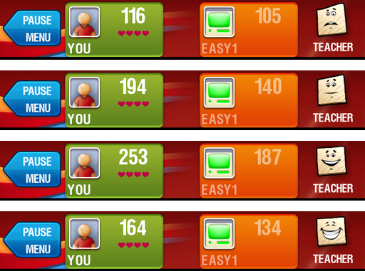
The change that immediately made the app unplayable for me is the “Teacher.” For those of you unfamiliar with the mobile version of Scrabble, the Teacher used to be this cute anthropomorphic Scrabble tile with a very expressive set of facial features: eyes, eyebrows, a nose, and a mouth. If you had the Teacher enabled, the Teacher’s face (appearing in the upper right corner of the screen) would express a range of emotions from passive disinterest to giddy joy depending on how good a word you made with your tiles. If you tapped on the Teacher the game would compare the word you made with the best possible word it could come up with. If you made an awful word when there was a very easy, high-scoring word possible, the Teacher’s expression would be one of horror. I remember chuckling to myself the first time I saw this; I could almost hear the Teacher say, “Oh my God! There was such an awesome word that you missed!” That was the old version. I used the Teacher feature often, as it helped my improve my vocabulary and determine whether or not I was ‘bringing my “A” game.’
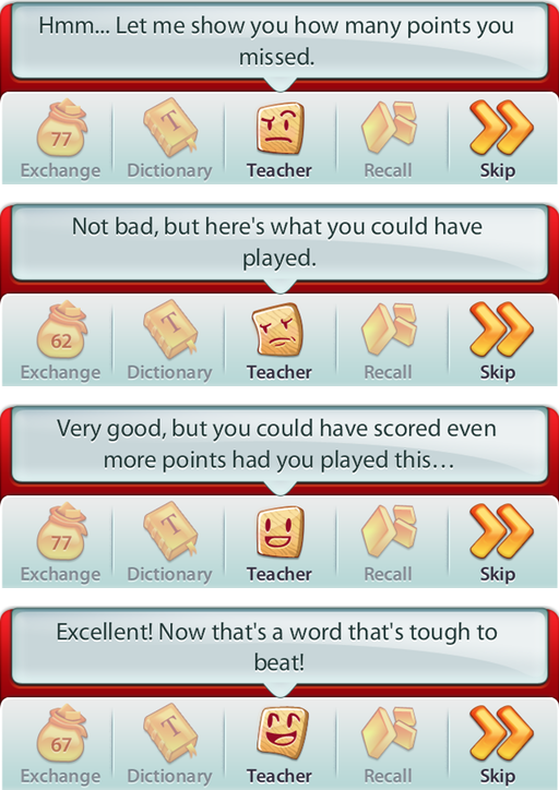
In the new version, the Teacher avatar has taken on a very different personality, and I’m sorry to say it’s not likable. First of all, the Teacher (now in the center of the bottom of the screen) speaks now. It’s very verbose. The developers must have thought it very important to have the Teacher speak every time, because when the Teacher is activated, after every move the rack of tiles is replaced with two lines of text in a speech bubble. As far as I can tell, there’s no way to get the Teacher to shut up, and when you play the game as often as I do, it gets really annoying.
The other change to the Teacher is its personality. Instead of being passive or smiling very little when you make a sub-optimal word, it now appears to be ‘angry.’ In the previous version of Scrabble the Teacher never appeared angry, just horrified (“I’m not angry, I’m just disappointed”). I feel silly even mentioning it, but it’s very off-putting to have the app appear to be ‘angry’ with you. This, along with the added verbosity, was distracting enough to get me to stop playing the game altogether.
What can developers learn from this?
I’m sure the developers of Scrabble thought they were making a wonderful enhancement to their app. However, the universal criticism of this latest update makes me think they didn’t test it with a real audience. Had they done that, surely they would have realized that the changes would not be received well. Of course, when tests reveal something as alarming as that, an organization needs to have the guts to abandon the work and go back to the drawing board. We’ve seen before how even the biggest organizations can fail spectacularly when they don’t test properly, and I suspect faulty or incomplete testing is to blame in this case as well.
This is particularly relevant to me, because I’ve been considering changing my app’s user interface pretty drastically myself. I’m just going to have to allocate a lot more time to have the beta testers test it in the various stages of development. That way, if there are any major missteps, I can fix them early and, most importantly, before deployment.
Summary
I wish there was a happy ending to this story, but there isn’t. I’ve moved Scrabble away from its previous prime location on my home screen. I’ve filled out the feedback form and let the developers know why I would never recommend the app as it is right now to my friends.
If there’s anything good about this, it’s the fact that this episode has reinforced in me the importance of valid, thorough beta testing. I hope Scrabble listens to the scores (maybe hundreds) of people who are leaving comments on the App Store and fixes the app or reverts it to the previous version. Until then, the one game on my home screen is once again the first game (maybe even the first app) I ever bought for iOS: Wurdle.


