In a previous blog post we learned what a histogram is. In today’s post we’ll see how to use histograms to help take properly-exposed photographs. If you haven’t read the previous post, or are not familiar with histograms, I would recommend you read that post before continuing with this one.
You may remember that in photography the term ‘exposure’ refers to the amount of light that enters the lens. A photograph that is considered to be correctly exposed is neither too bright or too dark. It’s just right. An underexposed picture is too dark - the dark areas are pure black, and therefore lack detail. Similarly an overexposed picture is too bright - the bright areas are pure white and therefore lack detail. Figure 1 shows an underexposed picture, and Figure 2 shows an overexposed one.
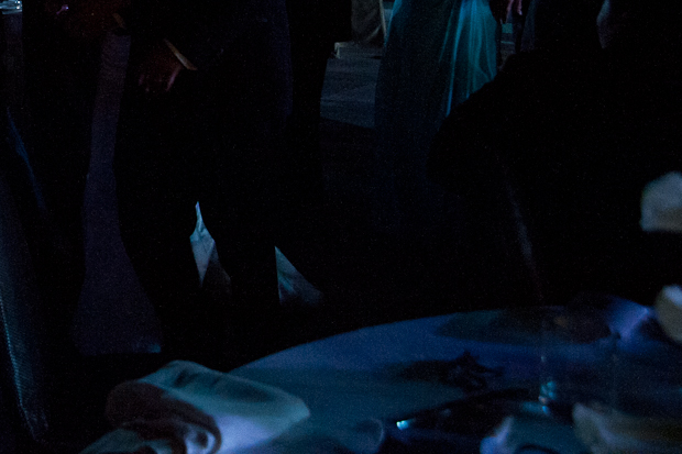
Figure 1 - An underexposed image
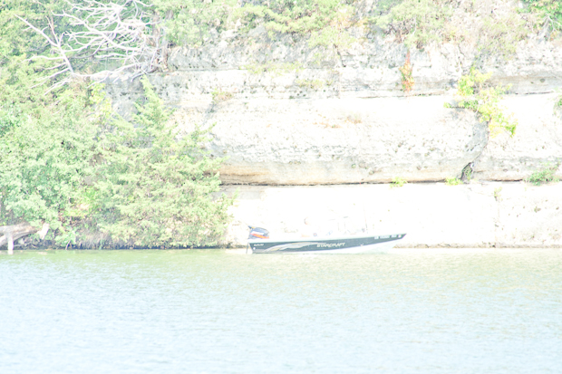
Figure 2 - An overexposed image
Modern digital cameras, whether they are point-and-click models or SLRs, have two main tools to help you determine the exposure of your pictures. The first is the light meter. The light meter will tell you whether or not the camera thinks your picture is well exposed. It usually displays some sort of linear indicator that ranges from “Very Underexposed” to “Very Overexposed.”
The second tool is the histogram. The histogram graphs the distribution of the different levels of light in the photograph (more on this later). Most cameras display the histogram on the LCD panel after you take the picture, but some now display a live histogram even before you “press the button.”
What Histograms Display
In order to understand exactly what the histogram displays you first need to consider the camera sensor (the CCD). When you take a picture with a digital camera, light enters the camera through the lens and falls on the the sensor. A different amount of light falls on each ‘pixel’ of the sensor. Each pixel converts the light into a corresponding voltage. This analog voltage is then converted to a digital value which is usually 12 bits (between 1 and 4096).
The histogram displays how many pixels are at each of these 4096 levels. The x axis represents the brightness levels - from 1 to 4096, where 1 is “very dark” and 4096 is “very bright.” The y axis graphs the number of pixels at each of these levels.
Examples of histograms
Each sensor has a range of how much light it can detect. That range is anywhere between 5 and 12 f-stops, depending on the sensor. (If you remember from this blog post, every lower f-stop doubles the amount of light entering the lens.) Now, if everything in your photo is at a brightness level that falls within your sensor’s range, that’s a good thing. Figure 3 is an example of such a picture.

Figure 3 - A properly exposed image
If the scene you’re trying to photograph is too bright for the sensor, some percentage of the pixels will have a brightness that is too high for the sensor to measure, so all of those pixels will be assigned the maximum brightness value (4096). This is when you start having problems - if the pixels in your image range in brightness equally from 3000 to 6000, every pixel from 4096 to 6000 will show up with a value of 4096 (pure white). So what’s happened is that you’ve lost 1004 pixels’ worth of information. All the detail of the image between 4096 and 6000 is lost. In that case you would be better off decreasing the exposure by increasing the shutter speed or decreasing the aperture (choosing a higher f-stop). Figure 4 is an example of such a picture. Look at the right edge of the histogram - the high number of pixels at the maximum level indicate ‘clipping’ of the histogram. That’s your data loss. Compare it to the histogram for Figure 3, which tails off nicely on the right end. Once you get the all the pixels back within the 0-4096 range (as seen from the histogram) you’re back to no loss of data.
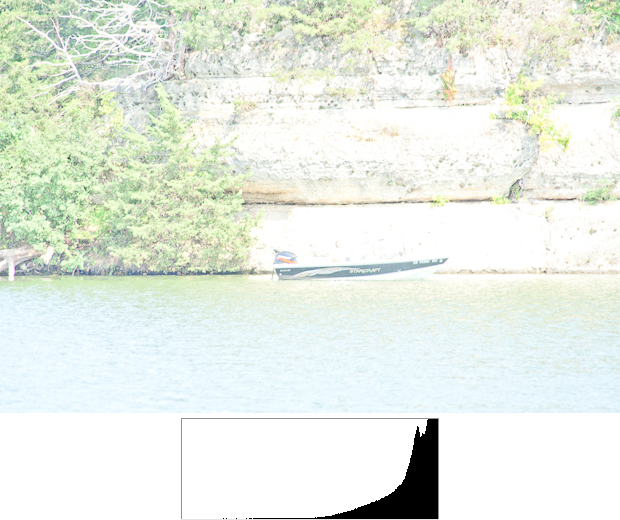
Figure 4 - A overexposed image
Now let’s look at the other scenario: If the scene you’re trying to photograph is too dark for the sensor, some percentage of the pixels will have a brightness that is too low for the sensor to measure, so all of those pixels will be assigned the minimum brightness value (1). If your range is 3000 (as in the last example) a large number of pixels will show up as black. Again, you’ve lost data, and lost detail in the image. In that case you would be better off increasing the exposure by decreasing the shutter speed or increasing the aperture (choosing a lower f-stop). Figure 5 is an example of such a picture. Look at the left edge of the histogram - the large number of pixels at the minimum level indicate ‘clipping’ of the histogram. That’s your data loss. Compare it to the histogram for Figure 3, which tails off nicely on the left end. Once you get the all the pixels back within the 0-4096 range (as seen from the histogram) you’re back to no loss of data.
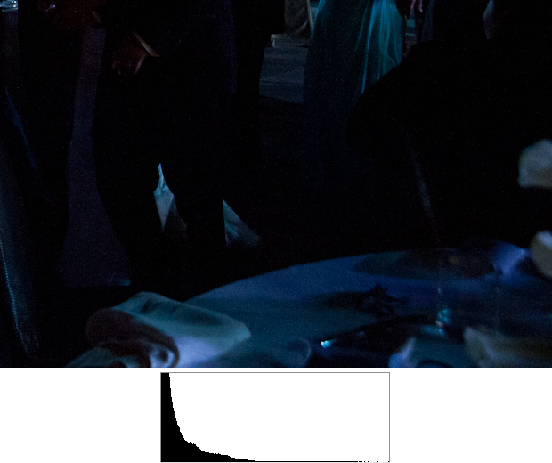
Figure 5 - A underexposed image
What if the range is too large?
Changing the exposure to get the histogram within the sensor’s range is a good solution as long as the range of brightness in the scene is less than the range of the sensor. However, common scenes in real life often have ranges higher than those of many of today’s best cameras. We don’t notice it often because our eyes have a ridiculously large range of about 10 f-stops, and when they’re paired with the processing of our brains, we can see better than cameras can. Figure 6 is an example of an image whose range is more than that of my camera. Notice the clipping on both ends. What should be done here?
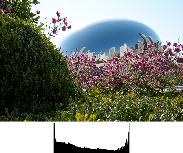
Figure 6 - An image with a wide range of brightness
There are two things you can do here, and you should consider doing them both. The first is biasing towards the highlights, and you do that while you’re on the scene taking the pictures. The human eye tends to focus on the brighter parts of the picture, and the brain expects shadows to be dark. You can take advantage of these expectations and expose your picture to minimize the clipping on the bright end (the right end). While that means you’ll get more clipping on the darker end, you’ll have more detail and greater tonal range on the brighter end. It’s very subjective, but pictures like that tend to look more natural and therefore better than pictures where the bright areas are washed out. You can see that this is what I did in Figure 7.
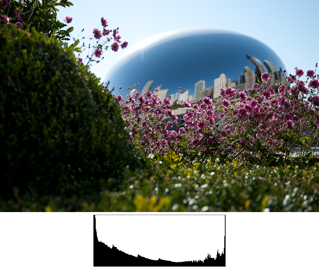
Figure 7 - Exposing for the higlights
The second thing you can do is post-process the image with image processing software. You do this after you import your picture into your computer. Two of the most popular image processing applications are Adobe’s Lightroom and Apple’s Aperture. If you’re shooting in RAW format (as you should be) there’s a lot of data in the image for you to play with. Post-processing images is a topic for a future blog post, but Figure 8 shows how the image changed after I took Figure 7 and increased the “Recovery” and added “Fill Light” in Lightroom. The histogram looks better now, but you can never get something for nothing. Look at the middle of the histogram - it’s gotten a flatter. The shape’s changed and image is a little washed out, now. Again, these are subjective settings. You need to play around with them until you get the kind of picture you want.

Figure 8 - After post-processing
What is the perfect histogram?
After all this talk about clipping and how to avoid it, you may ask yourself “What is the ideal histogram I should try to get in all my pictures?” There is none. A histogram isn’t good or bad. It’s just a way of looking at your picture. You get to decide if the image that shows up on the LCD panel is the image you want or not. If it isn’t, then the histogram can help you determine why. If you’re not sure, the histogram can tell you whether or not you’ll have room to play around with the settings once you start processing the picture. If there is no clipping you’ll have a lot of room to work with.
Figures 9 & 10 are examples of histograms with a lot of clipping. I don’t care, because these are exactly the pictures I was looking for - pictures with a lot of contrast and a lot of specular highlights (brightness where a light source is reflected off a shiny surface). In many cases specular highlights may be ignored - they’re actually good because they add to the ‘drama’ of the shot.
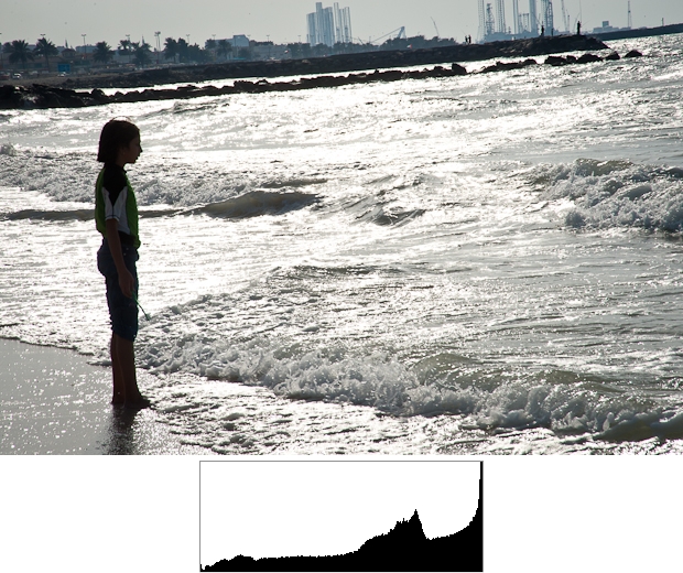
Figure 9 - An image with acceptable clipping on the right

Figure 10 - An image with acceptable clipping on both ends
Many cameras have a setting where they will display overexposed pixels (those where clipping occurs to the right) in flashing red. This helps you determine very easily just how much of your image has clipped. The image post- processing software allows you to do that as well.
Summary
Histograms are very powerful and easy-to-use tools. Learn how to read them, and then use them. Set up your camera to display the histogram after every shot is taken, for about 5 seconds. A quick glance will let you know whether or not you’ve “messed up the shot” and need to take it again. If your camera supports it, also set it up to highlight overexposed areas. I’ve found this to be very useful as well.
In a future blog post we will complete our discussion about histograms – we’ll learn how data is distributed on the histogram and how to maximize the data we have for post-processing. Until then, keep taking pictures (and use the histograms).
References
- Understanding Histograms by the wonderful site The Luminous Landscape.
- Chapter 2 of Mastering the Nikon D700 by Darrell Young and James Johnson.
Thanks to John Gallagher for reviewing an early draft of this post and giving me his feedback.